
Choosing the right color scheme for your living area is one of the most exciting aspects of home design, but it can also be daunting. The colors you choose will define the atmosphere, set the mood, and reflect your personality. With so many shades, tones, and palettes to choose from, how do you pick the perfect combination for your space? In this guide, we’ll explore the essentials of color theory, lighting, and design tips to help you craft a living area that’s both beautiful and functional.
Understand the Basics of Color Theory
Primary, Secondary, and Tertiary Colors
To begin, it’s essential to understand the basics of the color wheel. Primary colors—red, blue, and yellow—cannot be created by mixing other colors, while secondary colors like green, orange, and purple are made by combining two primary colors. Tertiary colors are formed by mixing a primary and a secondary color. Understanding how these work together can help you select complementary or contrasting colors that enhance your space.
Warm vs. Cool Colors
Warm colors, such as reds, yellows, and oranges, evoke feelings of energy, warmth, and excitement. In contrast, cool colors like blues, greens, and purples promote calmness and tranquility. The choice between warm and cool tones can dramatically change the ambiance of your living area. If you want a cozy, inviting space, warm colors may be ideal. If relaxation is your goal, cooler tones can create a serene atmosphere.
Consider the Purpose of Your Living Area
Social Gathering Spot or a Relaxing Retreat?
What role does your living room play in your home? Is it a lively space where you entertain guests, or is it a quiet retreat where you unwind after a long day? A social space might benefit from vibrant, bold colors like reds or yellows that stimulate conversation and energy. On the other hand, if your living area is a sanctuary for relaxation, softer, muted tones like pale blues, grays, or earthy greens can promote calm and restfulness.
Aligning Color Choices with Activities
Consider the activities that typically occur in your living room. If it’s the family movie night hub, dark tones can create a cozy, cinematic feel. For reading corners or artistic spaces, lighter shades will reflect more light and make the area feel open and inviting.
Evaluate the Natural Lighting in the Room
The Influence of Natural Light
Natural light can significantly affect how colors appear in your living area. Rooms that receive abundant sunlight tend to make colors look brighter and warmer, while darker rooms may dull those same colors. If your room faces north, cooler light might make the space feel cooler, so you may want to balance it with warmer hues. Conversely, south-facing rooms get plenty of sunlight, and you can afford to experiment with darker shades.
Time of Day and Color Shifts
Remember that the lighting in your living room changes throughout the day. Colors that look vibrant in the morning may seem subdued at night. Test your chosen shades under different lighting conditions to ensure they provide the effect you want at all times.
Identify a Focal Point for Inspiration
Using Furniture or Art as a Color Anchor
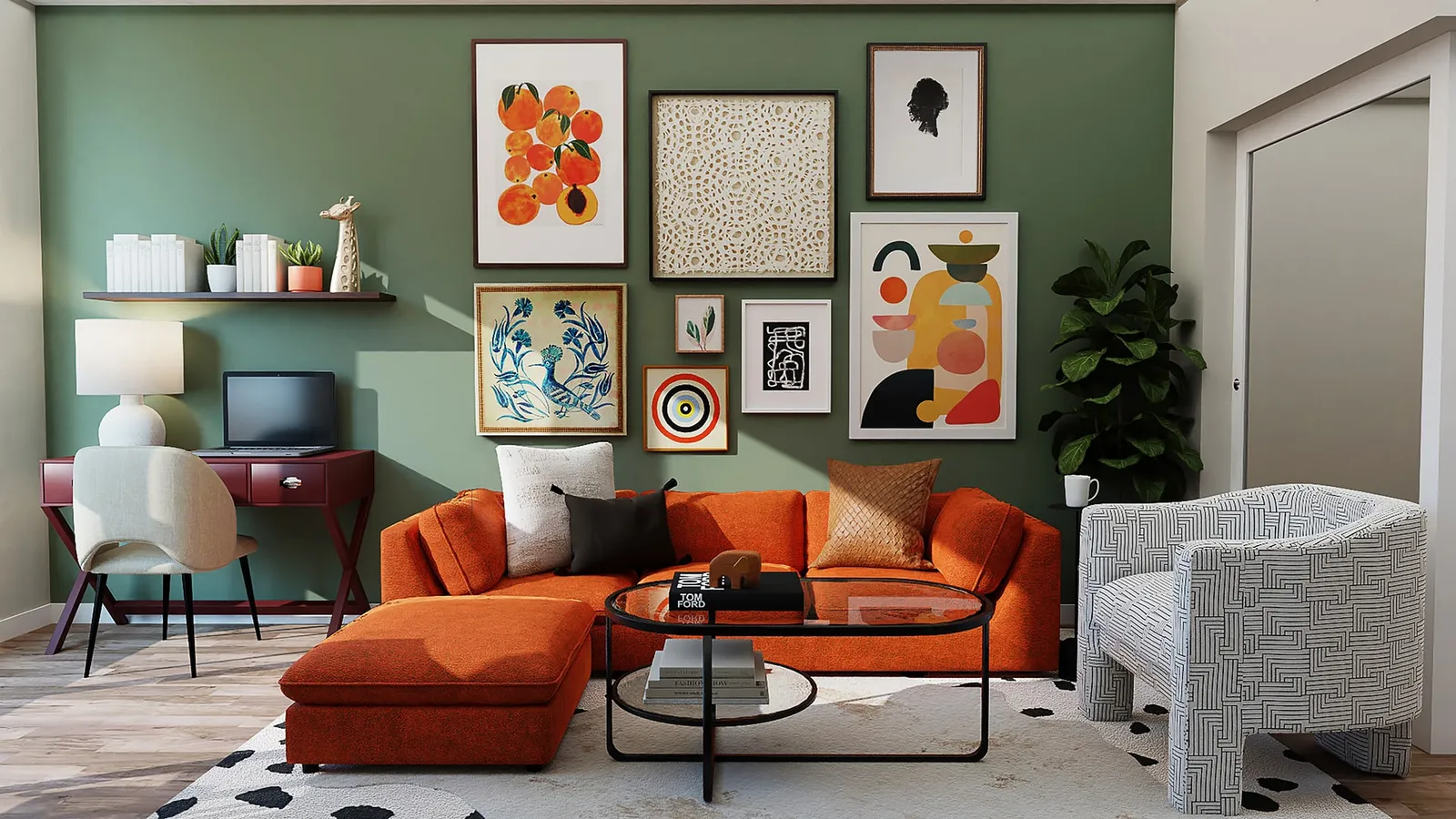
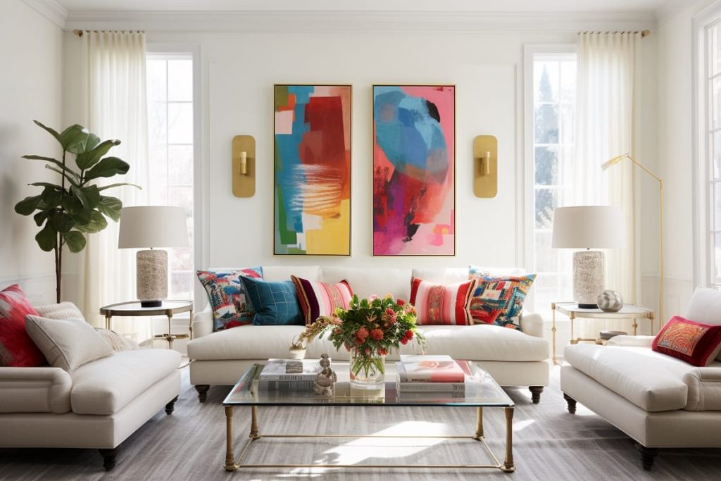
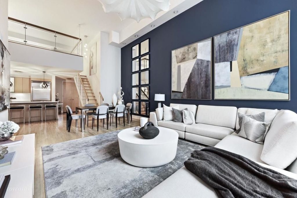
If you’re unsure where to start with your color scheme, look to a standout piece in your living room—whether it’s a statement sofa, a bold piece of artwork, or a patterned rug. Use the colors in these pieces as a foundation for your palette. For example, if your sofa is navy blue, you could build a color scheme around cool blues, soft greys, and whites.
Incorporating Existing Elements
Take into account any existing features you want to keep, such as hardwood floors, fireplaces, or exposed brick. These elements should be factored into your color choices to create a cohesive look. You don’t want your new color scheme to clash with your room’s permanent fixtures.
Choose a Dominant, Secondary, and Accent Color
The 60-30-10 Rule
One of the most popular design techniques for color balance is the 60-30-10 rule. This rule suggests that 60% of the room should be a dominant color, 30% a secondary color, and 10% an accent color. Typically, the walls are the dominant color, larger furniture pieces take the secondary role, and smaller decor items, like pillows or artwork, provide the accents.
How to Mix and Match Colors
To create a cohesive look, mix complementary colors (those opposite each other on the color wheel, like blue and orange) for contrast, or analogous colors (next to each other on the wheel, like blue and green) for harmony. Don’t be afraid to experiment with combinations that reflect your personality and design vision.
Test the Color Before Committing
Paint Swatches and Samples
Never commit to a color before testing it in your space. Paint swatches on different walls to see how the colors change with the light. Live with these samples for a few days and observe how they appear at different times of the day.
Digital Tools and Apps for Visualization
If you’re still unsure about committing to a color, take advantage of digital tools that allow you to visualize your living room with different color schemes. Many apps offer virtual room makeovers, helping you imagine how your chosen palette will look without the need for physical samples.
How to Use Neutrals in Your Living Area
Choosing the Right Neutral Palette
Neutral colors are a great foundation for any living room, providing versatility and timelessness. Warm neutrals like beige, cream, and taupe add coziness, while cool neutrals like grey and white create a modern, sleek feel. The right neutral palette will depend on the vibe you want to create and the amount of natural light in your space.
Adding Depth with Texture and Patterns
To keep a neutral palette from feeling too plain, incorporate different textures and patterns. Layer in a plush rug, metallic accents, or wooden furniture to add depth and interest. A mix of textiles, such as wool throws, velvet cushions, or linen curtains, can prevent the space from feeling too one-dimensional.
Incorporating Trends Without Sacrificing Timelessness
Balance Timeless Choices with Modern Trends
While it’s tempting to follow the latest trends, aim for a balance between trendy colors and timeless choices. If you want to incorporate a trendy color like sage green or terracotta, use it sparingly in decor pieces, such as throw pillows or vases, while keeping the main elements like walls or furniture more neutral.
Color Accents as a Way to Update
Trendy accent colors can easily be switched out when styles change, allowing you to keep your space up-to-date without a full renovation. Add pops of current colors through easily replaceable items like artwork, throw blankets, or table lamps.
Choosing the right color scheme for your living area is all about balance—between warm and cool tones, boldness and neutrality, and timelessness and trends. By considering the function of your space, its natural lighting, and your personal style, you can create a living area that feels cohesive, welcoming, and uniquely yours. Take the time to test colors before committing, and don’t be afraid to experiment.